4 Types of Logos & What You Should Learn From The Most Iconic Brands In The World
Already have a logo for your brand? Is it a responsive one? About to start designing one? Then this article will help you learn all that you need to know about business logos and what effective logo designs entail.
4 TYPES OF LOGOS
LETTERMARK
A lettermark logo is made up of a company or brand’s initials. It’s also referred to as a monogram. Because they are often comprised of a limited amount of characters, lettermarks are always clear and legible, even when scaled down on mobile or a business card!
Ex. CNN, NASA, IBM, etc. Get the idea?

If your company’s name is a long and a mouthful, you should consider using a lettermark.
WORDMARK
A wordmark is the simplest kind of logo and usually focuses on the name of the business or brand. Ex. Digicel, Facebook, Solo, Disney etc. This type of logo can be a really effective way of making your logo clear and legible, especially if you have a distinctive or original business name. It's critical to pick the right font that reflects your brand. If you have a really long company name, wordmarks aren’t for you! Consider using a lettermark.

BRANDMARK (PICTORAL MARK)
A brand mark abandons text completely. Think Apple’s apple, Nike’s swoosh & Twitter’s bird. A brandmark can be a good way of transcending language and making sure you are instantly recognizable all over the world. If your company is lacking brand recognition, brandmarks are not the best choice. Your icon might look great and represent your company perfectly, but if nobody knows who it belongs to, it’s useless.

COMBO MARK (THE WINNER!)
Arguably the best of both worlds, the combination mark offers the clarity of typography and the visual appeal of an icon. This makes combination marks ideal for new and established brands alike and is the most commonly used type of logo. The drawback is that by combining type and a brandmark you necessarily create a larger and more complex logo. As a result, combination marks can often be difficult to apply across a range of marketing materials. This is where it helps if you if you have a responsive logo designed for your brand!

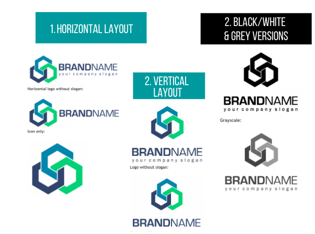
WHAT IS A RESPONSIVE LOGO?
Responsive logos are shape-shifting logos that change in size, complexity to accommodate and adapt to wherever they are placed.
That means its design elements vary slightly depending on the device or screen size they are displayed on without sacrificing brand identity. The design elements in question could be icons or symbols, business names and slogans, colors, backgrounds, outlines, and other details.
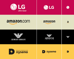
Examples:
Notice how as you go from left to right, scale decreases and design elements simplify. No matter the size of the device or placement for these companies, they have a logo form suited to that environment.


Now that you’ve taken a look at some examples, here’s the rulebook for designing a responsive logo for your brand.
Make sure you hire a skilled and knowledgeable logo designer who is able to design responsive logos, no ands, ifs or buts!
Good Luck!